My personal BEST OF Information is Beautiful Shortlist
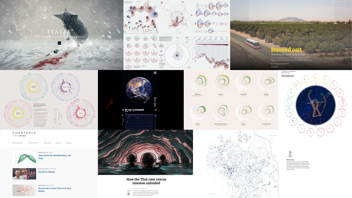
The Award ceremony of Kantar Information is Beautiful Awards 2018 is a history now. Since I started to make my best of list just before the ceremony, I am sharing which pieces made the biggest impression on me.
I could say there is almost nothing I didn't like while I was browsing the short lists for each category. I tried to pick up one for each and it was a hell of a job!
Arts, Entertainment and Culture
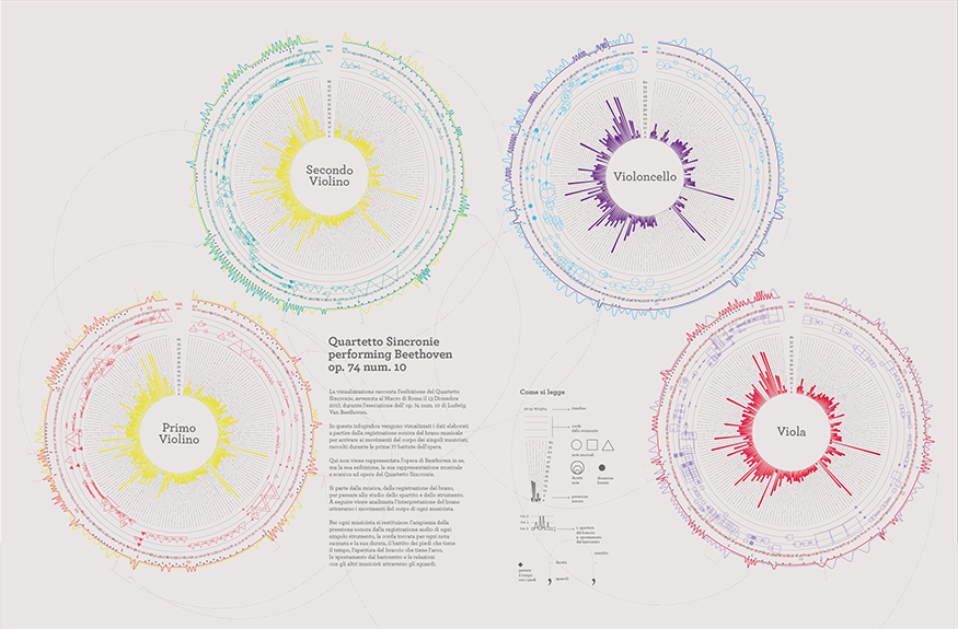
This project struck me for many reasons and even though the category is full of beautiful art, complicated coding and mind blowing visualisations, I choose this final thesis project for these reasons:
1) Yes, it IS a final thesis project. And finishing my own lately, I have even deeper admiration for this one.
2) It is not "just" an illustration, it is hard data. As the creators say, it is not just an attempt on representation of the music. There is a lot of procedural and punctual work behind it. From the concept and plan how to obtain the data to the final graphic itself, it had to take a lot of different kinds of hard work, producing accurate and yet emotional picture.
3) The "how we made it" part. As someone who is trying to get a grasp of how to actually make these brilliant pieces kind of step by step, loosing my mind always missing something, I had to appreciate the description of how they proceeded in the work process. They made whole story on Behance, which you can access by the hyperlink above.
Breaking News
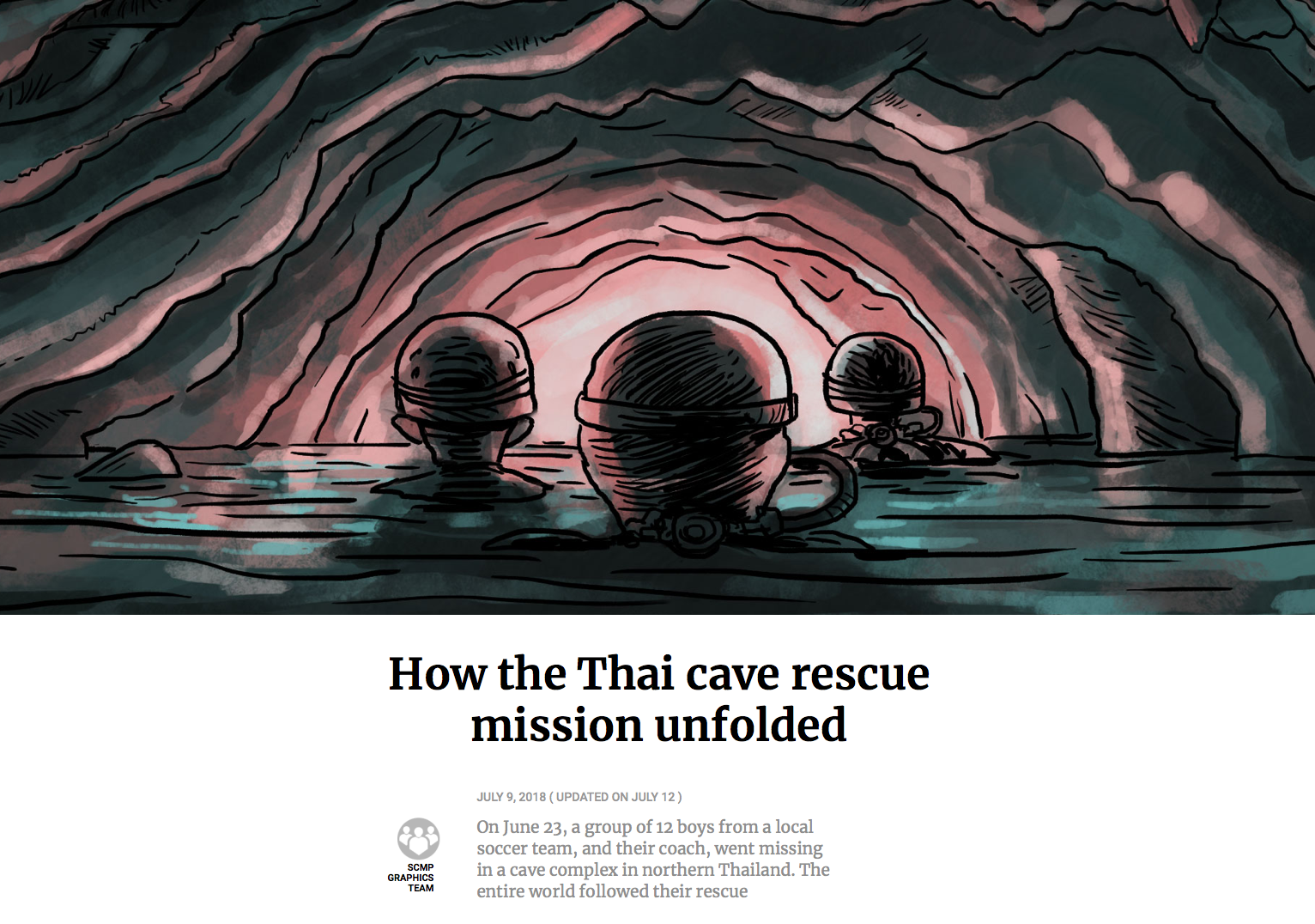
Thai boys rescue by South China Morning Post
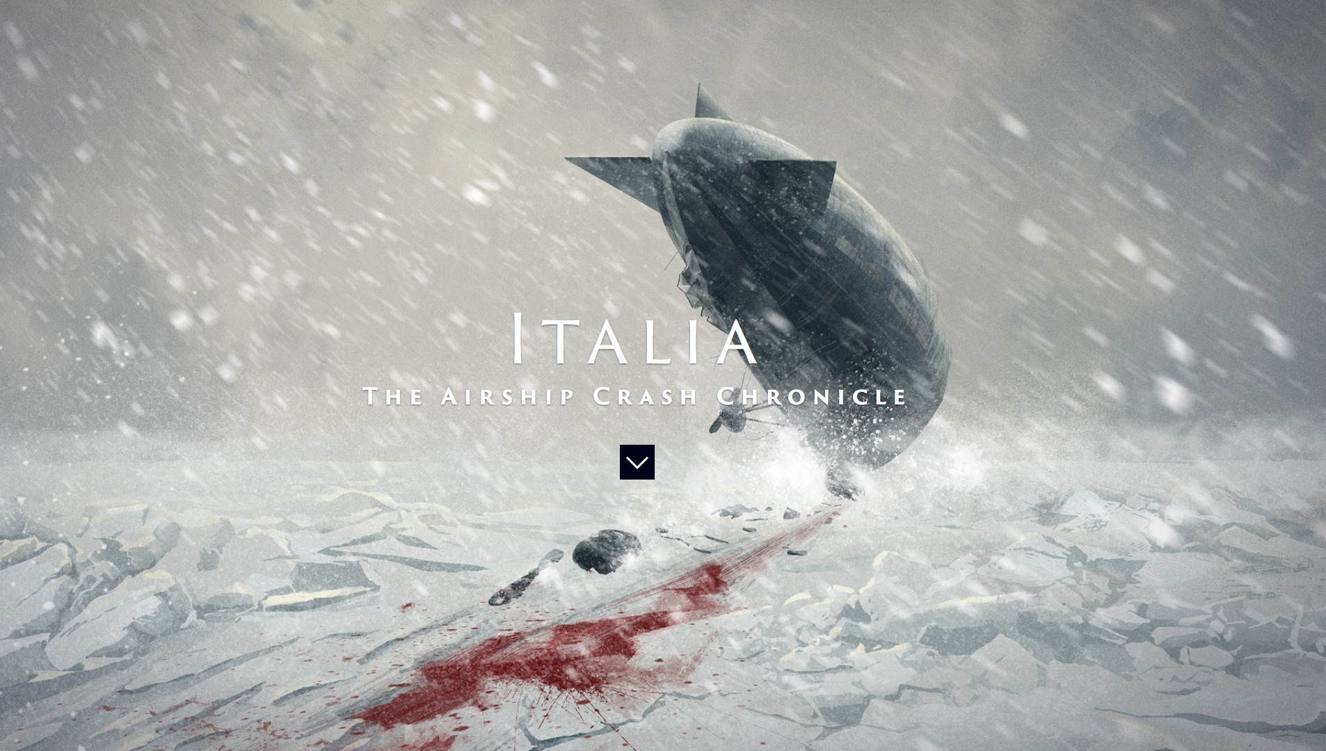
As a graduated journalist and someone whose dream is a career in visual news and data journalism, I was truly excited about the announcement of the Breaking News category. Although in my opinion most of the shortlisted work is more about the insight and working with data rather than beautiful visualisations, it was still a hard decision. My two most favourite viz focused media (let's say) are among those competing - South China Morning Post and Italian La Repubblica with Francesco Franchi's amazing illustrations.
At the end, if I had to choose a personal winner in the context, I vote for Thai boys rescue article from South China Morning Post. Why?
1) It fits the category the most. It is breaking news. It is beautiful (not only) because of the illustrations. It is that easy.
2) I have compared it to the others... ...and I had no more doubts. Even though I like La Repubblica's stories a lot, this particular one did not impress me that much as all the others and so I've got a winner.
P.S.: Don't take me wrong — all the works are great in the category!
Humanitarian
Life in the Camps by Reuters
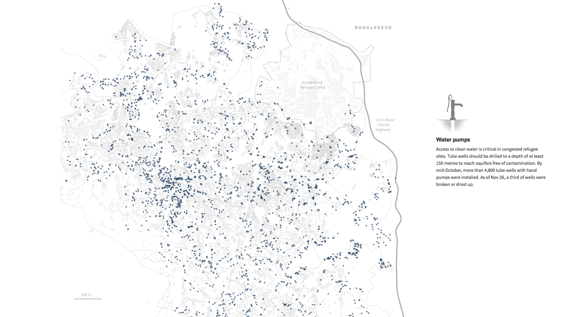
This complex project focusing on the Rohingya crisis got my full respect long time ago. Loads of data combined with great and clear storytelling into well structured and well designed story, leaving strong impact after reading.
Although the beautiful Aleppo story could easily win my vote, for the love of journalism I have to appreciate the job very well done.
Leisure, Games and Sport
A Night Under The Stars by Jordan Vincent
The sport related infographics often grabbed my attention. I don't know if the data are so clear or if it's just a good topic to visualize, but it works. The sadder I felt when I realised I am just scrolling through all those in the shortlist this year.
The Reuters Graphics scored again with the World Cup coverage, but:
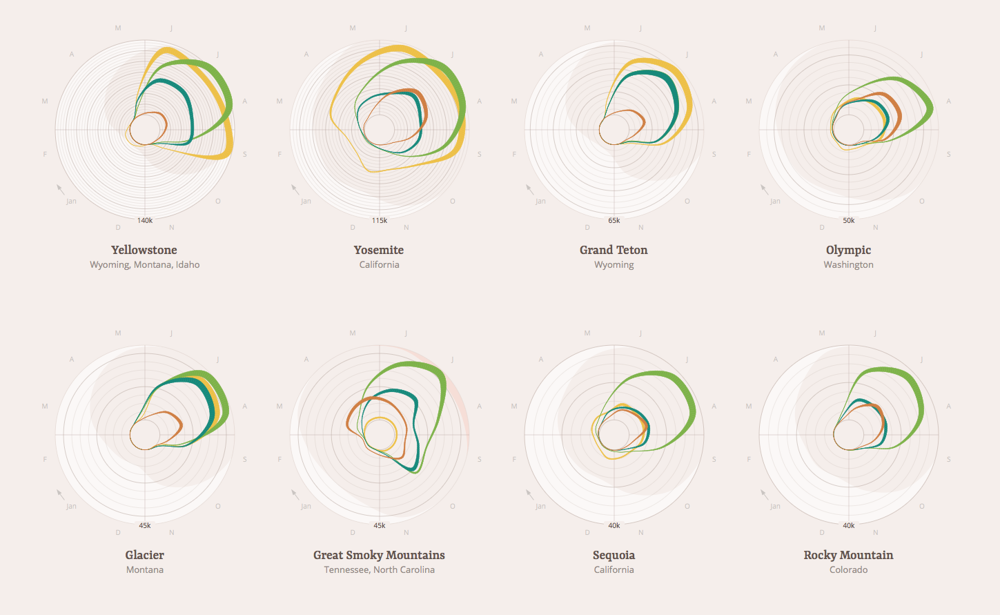
1) I am a fan of repetitive data visualizations. And this one is quite simple (in terms of readability) yet informational and visually attractive.
2) Let's give some attention to others then Reuters. Can't give them all the categories ;)
Maps, Places and Spaces
The category I have been very courious about for two reasons. First, I love maps and I am planning to get my mapping skills at least at the basic level very soon; second, I tried to make a couple of maps and I have found it quite complicated.
It is also a category slightly standing out. Maps are already visuals and you kind of can't make a map without thinking about how it will look like.
Even though maps need even more data than other vizes, it seems very light and user friendly and you don't necessarily SEE any data on the first sight.
That is why I have decided to give up on hard data and vote for a story developed almost to a level of a short novel!
Full of illustrations, photos, interactive maps and text (!), this story made me read breathlessly.
People, Language and Identity
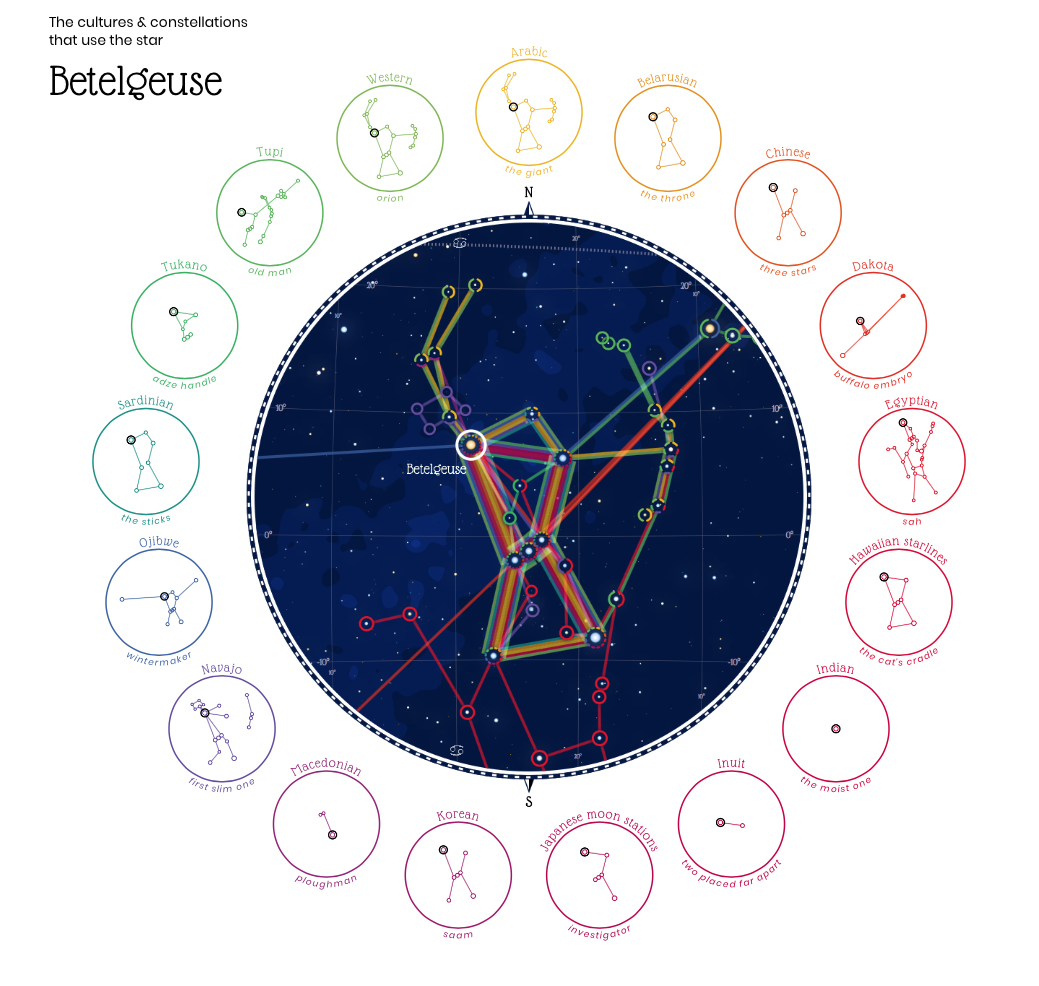
Figures in the Sky by Nadieh Bremer (information designer and ASTRONOMER!)
I always loved to look up to the sky in the summer camps and it stayed one of the most beautiful memory from a lot of trips I made! Living in London, one doesn't exactly enjoy the stars and that's for sure one of the reasons I had to pick this lovely infographic.
Memories like studying night sky maps when I was a child or climbing the highest mountain of Spain to observe The Milky Way and all the stars triggered. (BTW the mountain Teide can be found on Canary islands, therefore no light pollution and its peak is almost 4000 metres above sea level. Highly recommended!)
Finally, I really liked the idea of comparing the cultures in this context.
Politics and Global
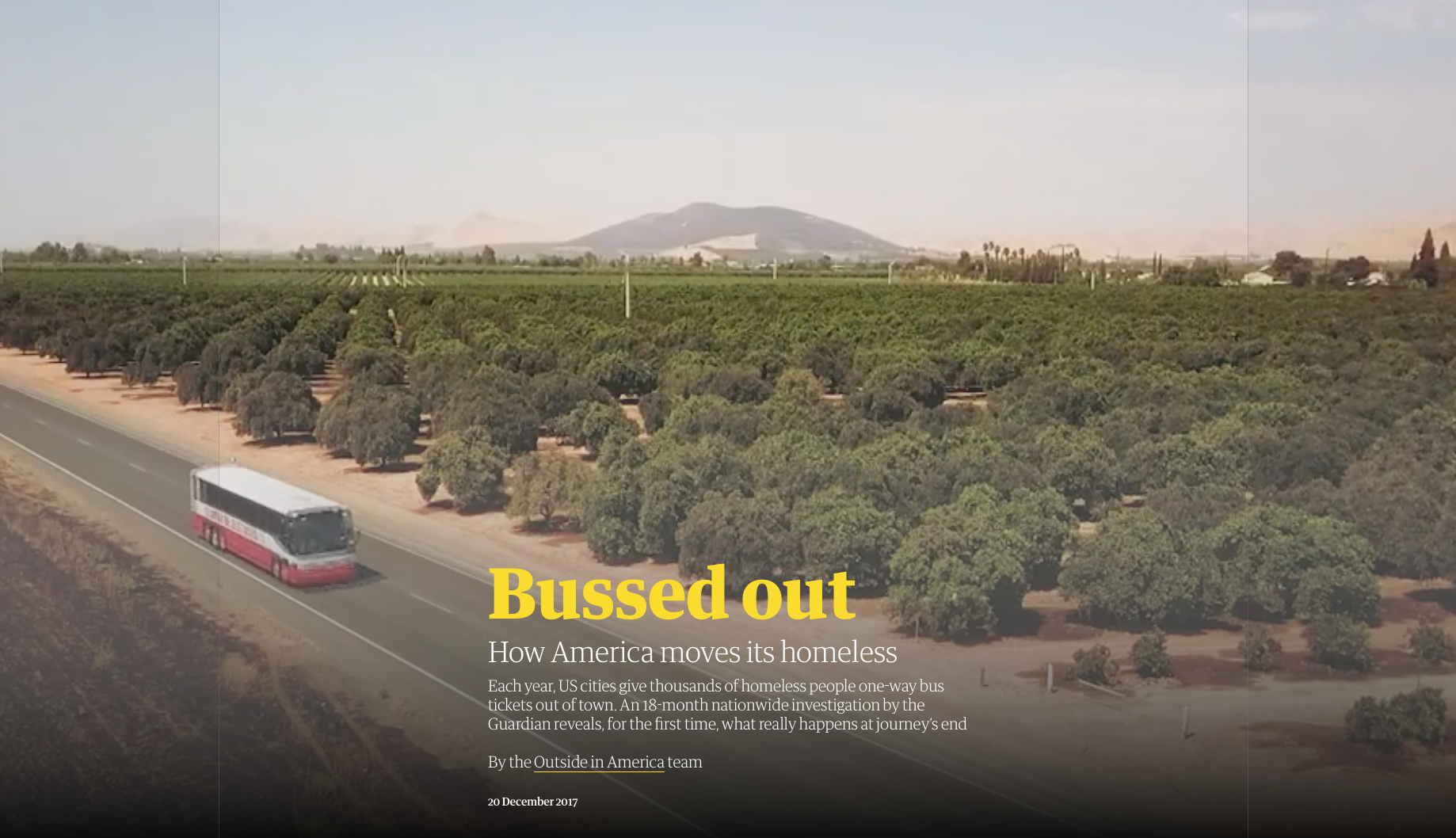
Bussed out: How America moves its homeless by The Guardian (US)
Tough one. I concider this category full of brilliant stories and great examples of journalism work. But which one is the most beautiful?
Bussed out is a story uncovering an unknown system, its pros, cons and consequences. It is full of different kinds of story supporting visual material. I really liked the use of videos (or gifs) in the background of each headline. The data visualization is nice and clear as well and all together it creates very well structured article.
Visualization and Information Design
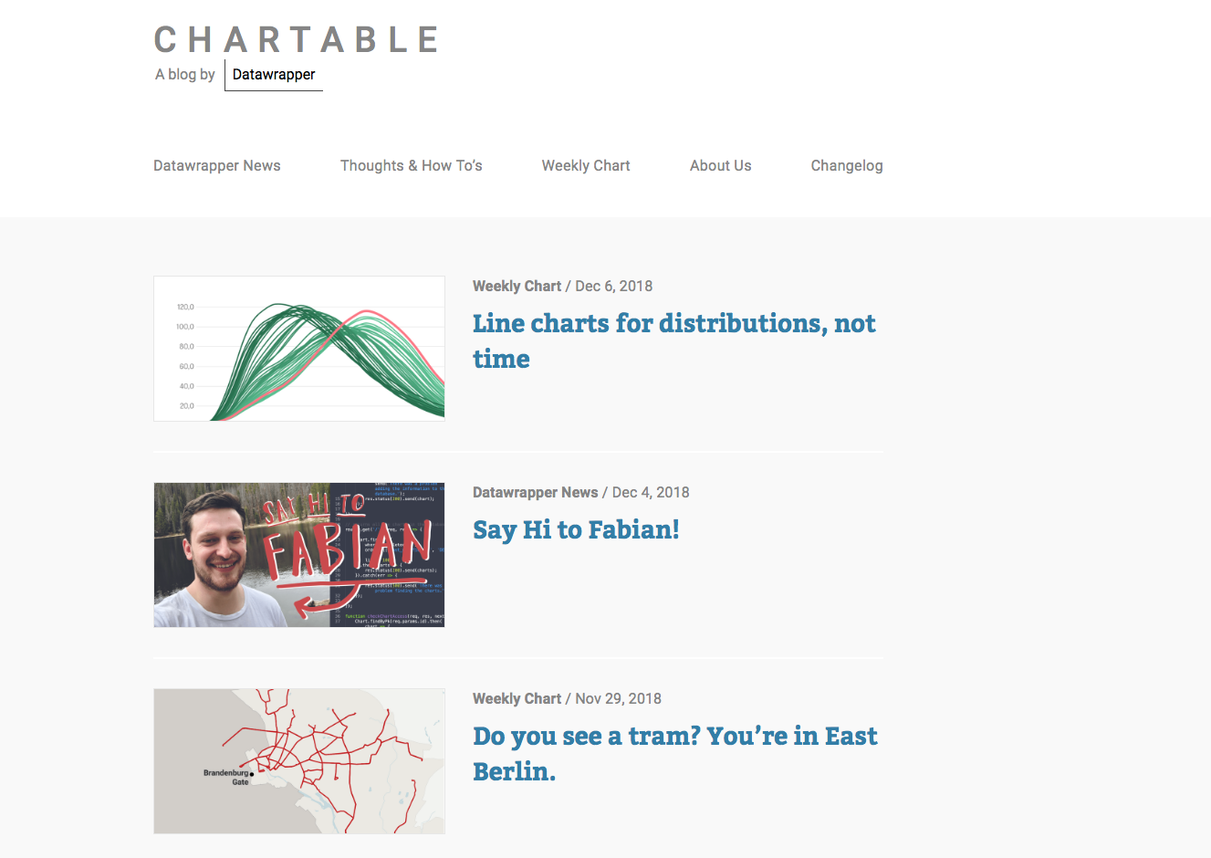
Chartable by Datawrapper
Apps. That would be the most describing word for the category. As it mostly depends at least partly on the user how the viz would like, I had to appreciate the Datawrapper blog the most. It is not a first time I have visited it, thinking it is nice, clear and neat example of how to share your passion for data.
No more comment needed:)
Science and Technology
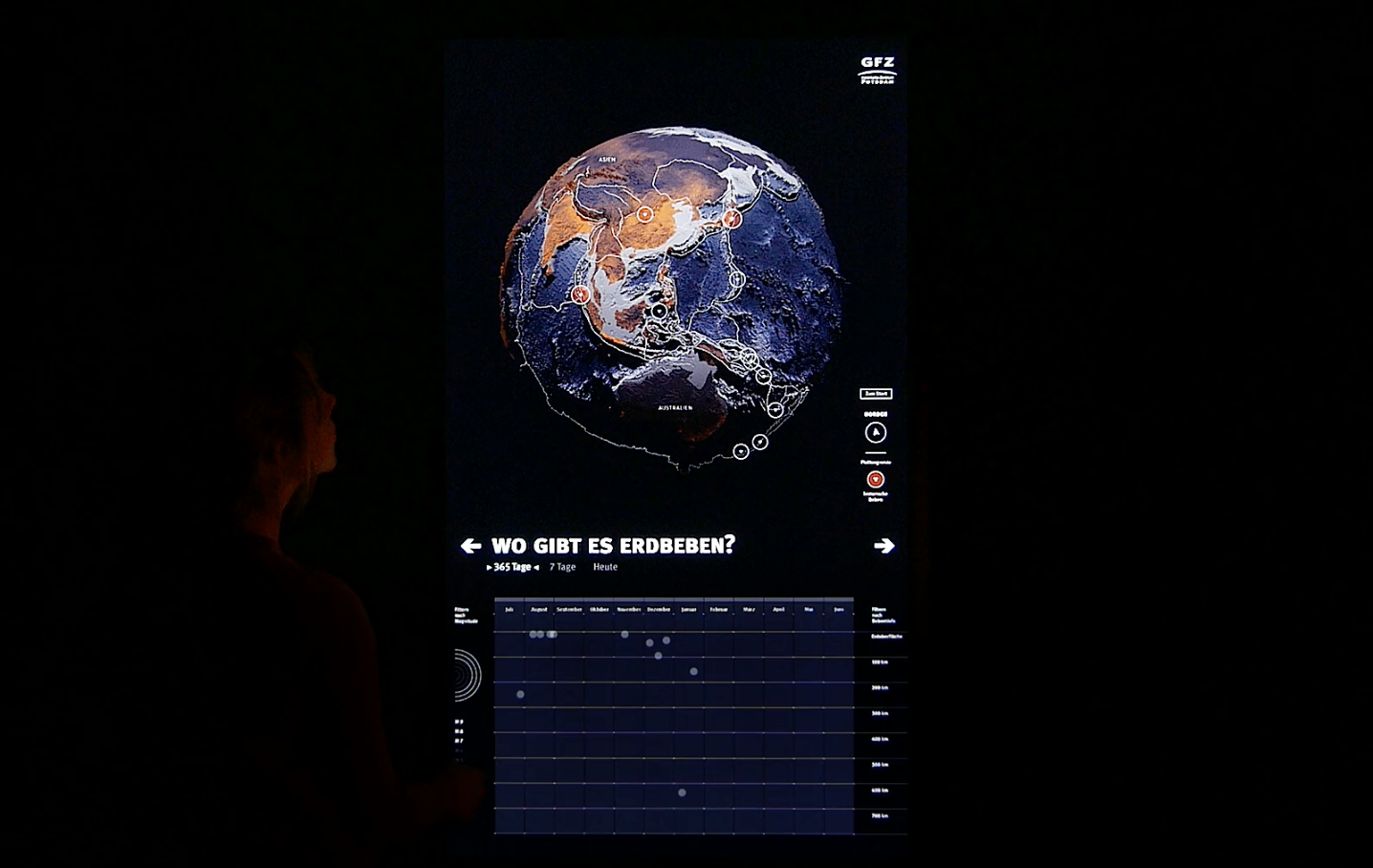
Dynamic Planet Scientific Poster by SciComLab
Category which I have been longlisted in was full of incredible projects. I have chosen this "poster" as a different medium than others and for its great atmosphere and technological appearance.
Also, suddenly I have felt like I am spending a day at a Natural Science Museum which I love. Thumbs up, I hope we will see many of projects like this, learning loads of new things, not only about our planet.
Unusual
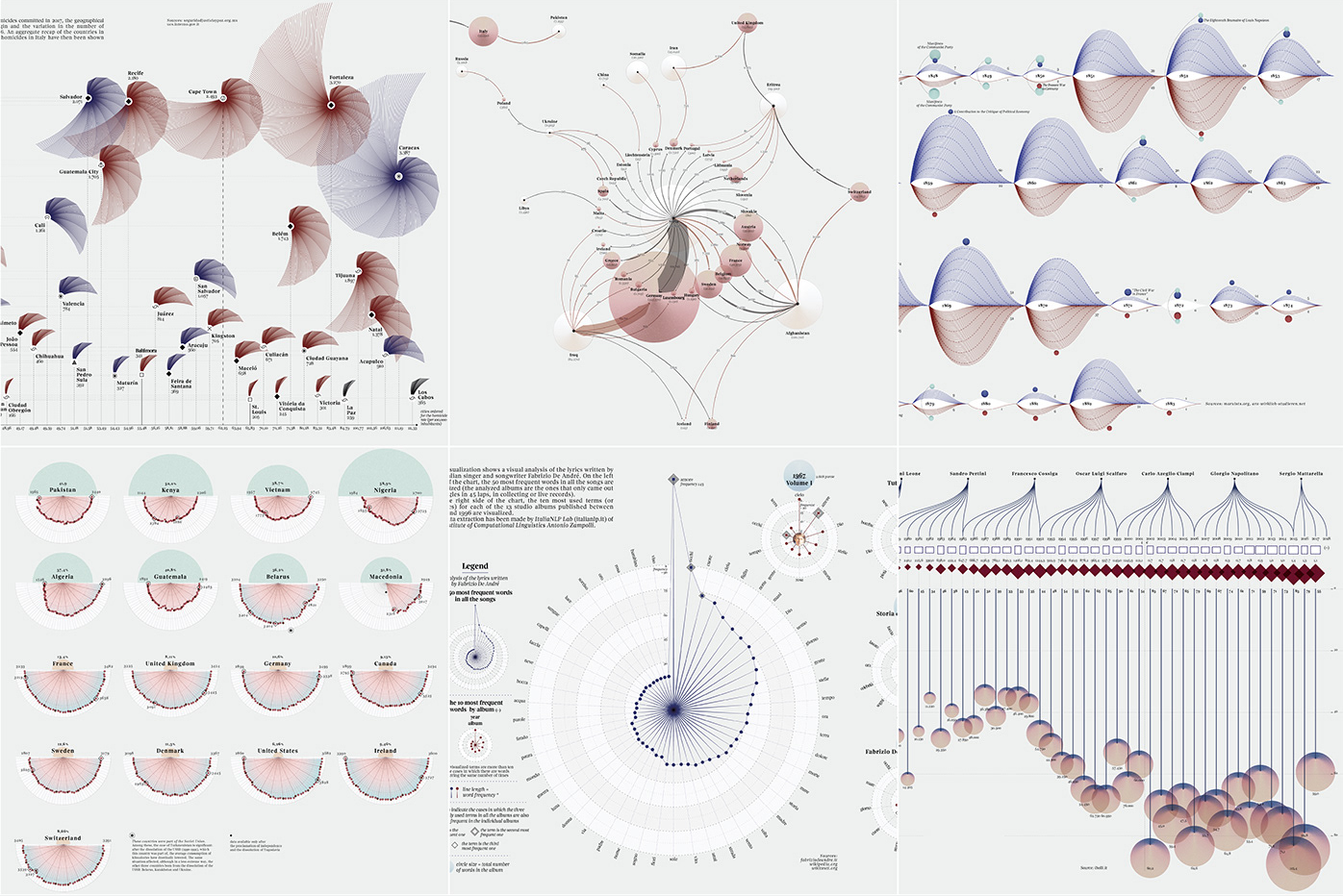
Visual Narratives by Federica Fragapane
